
ACCESSIBLE • RELIABLE • ADAPTIBLE
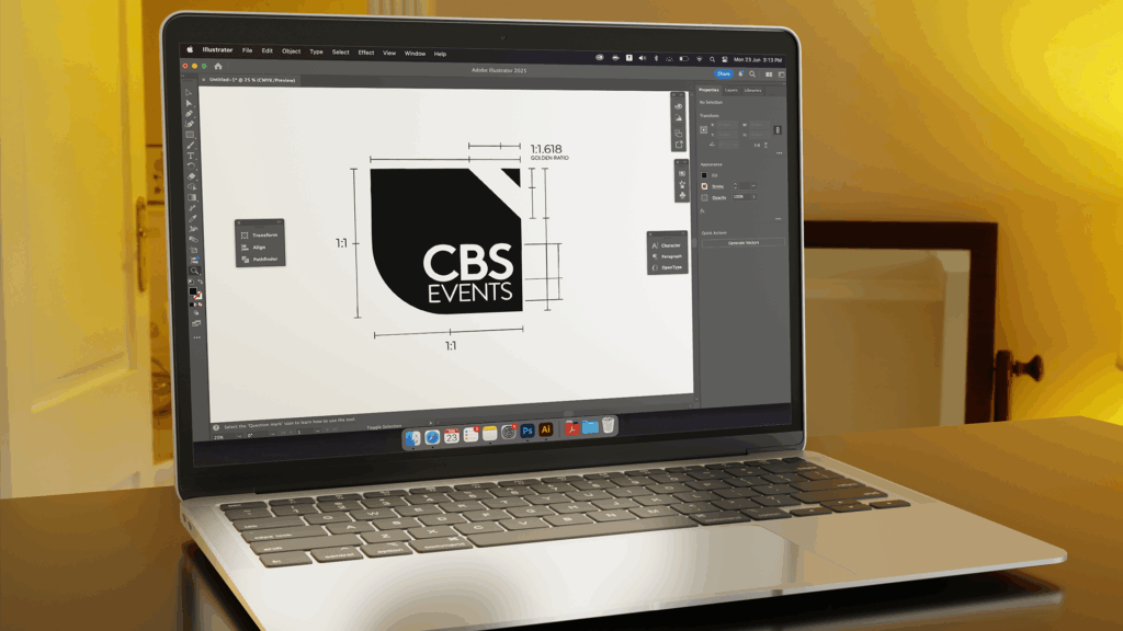
Astu Studios and CBS Events have shared a long standing working relationship. So when CBS was looking to rebrand, we were only too excited to jump on the collaboration opportunity. When we conducted an exercise to find out how the core team perceived their own brand, the direction was clear. They saw themselves as engineers, artists, and street smart solution seekers. They keywords that stood out were ‘accessible’, ‘adaptable’, ‘relatable’, and ‘creative’ – attributes of a pencil.
Incidentally, the earlier logo was a pencil, albeit with a bit of grunge. We decided to build on the idea and clean it up – show the new logo as ‘same old philosophy but renewed energy’. The new identity is an evolved representation of a pencil – one facing top right. It is sleek, has presence and breathes with plenty of negative space, balancing the sharp with the soft in its outline. It is friendly, and professional at the same time. The yellow brings optimism and warmth.
LOGO REVEAL AV

"I can confidently say that the rebranding journey with Astu Studios has been one of the most creatively rewarding collaborations we've had. Surya brought a rare mix of intuition, strategic clarity, and poetic precision to the process, turning abstract aspirations into a brand that feels unmistakably ‘us’. Kudos to you, Surya and the Astu team, for shaping an identity that’s aspirational, yet an evolution of who we are in terms of visual identity. We’re looking forward to a long and inspiring association with Astu on many more creative endeavours ahead."
Bhaskar Simha
Co Founder & Director


